Designing a brand and UX that takes a novel digital wine collecting experience and makes it feel tangible, social, physical and fun: Naming, branding, print, web, social and a unique product UX.
CLIENT: Tuesday Cellar Co
INDUSTRY: Wine / Subscription Service
AGENCY: Freelance
ROLE: Creative Director & Design Lead
OVERVIEW
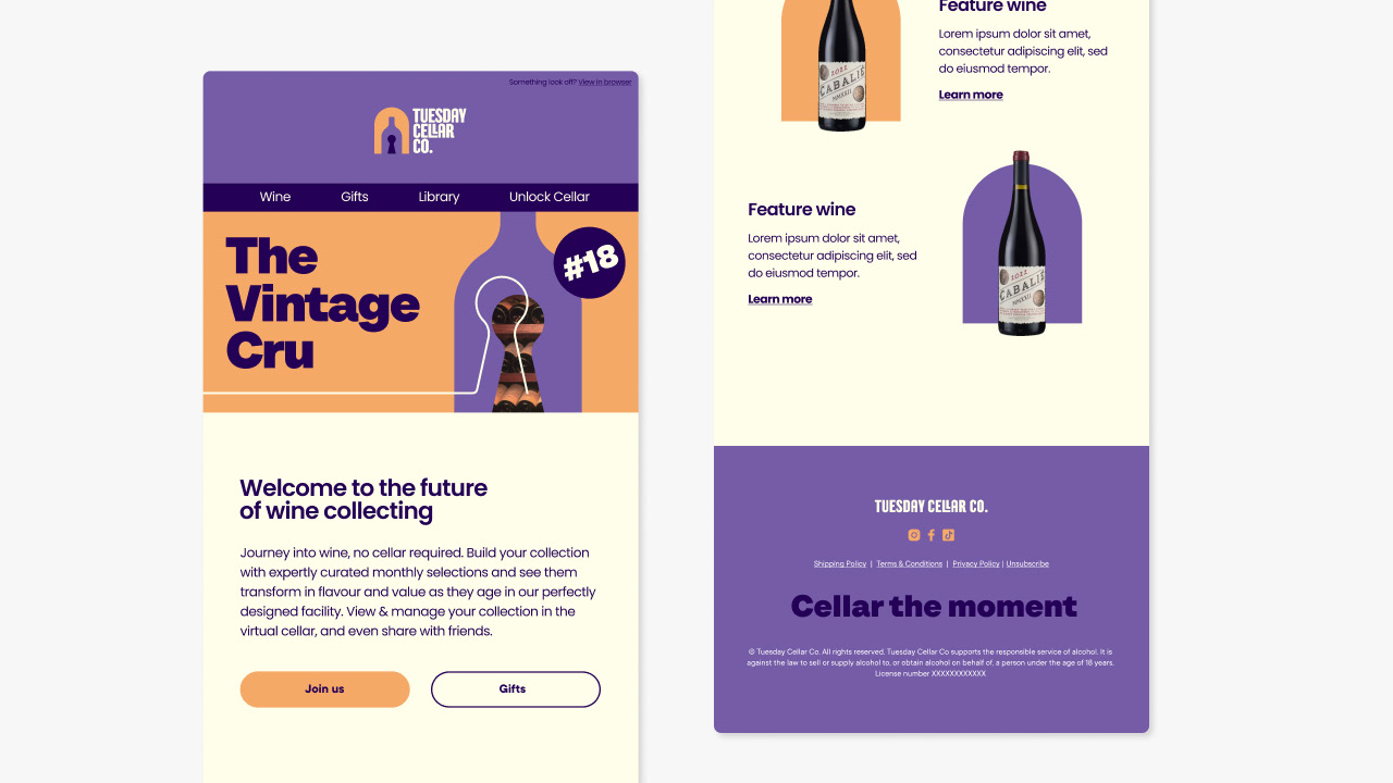
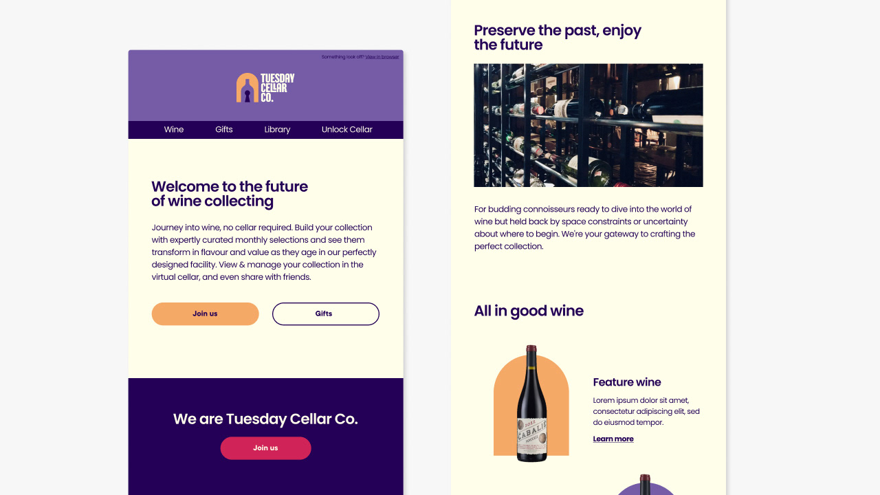
An Australian start up required a complete creative solution to realise their unique innovative product that brings the joy of wine cellaring to those without space for a cellar at home (and without the conventional wine-snobbery). The design of the branding and digital experience brings the idea to life in a fun and engaging way that is designed to attract and appeal to the target audience.

Brief in Brief
WANT: Complete branding, website design, and UX & design for unique digital product. Focus on community, fun and playfulness in both branding and the product.
AESTHETIC: Bold and high impact whilst remaining fun, playful and approachable. Avoiding an exclusive, pretentious or grandiose aesthetic but maintaining a sense of authority and quality. (Creating a culture around wine collecting and ageing without the traditional snobbery)
AUDIENCE NOTES: Broad demographic of: Collectors, tentative wine enthusiasts, & wine subscription service buyers. (Personas supplied)
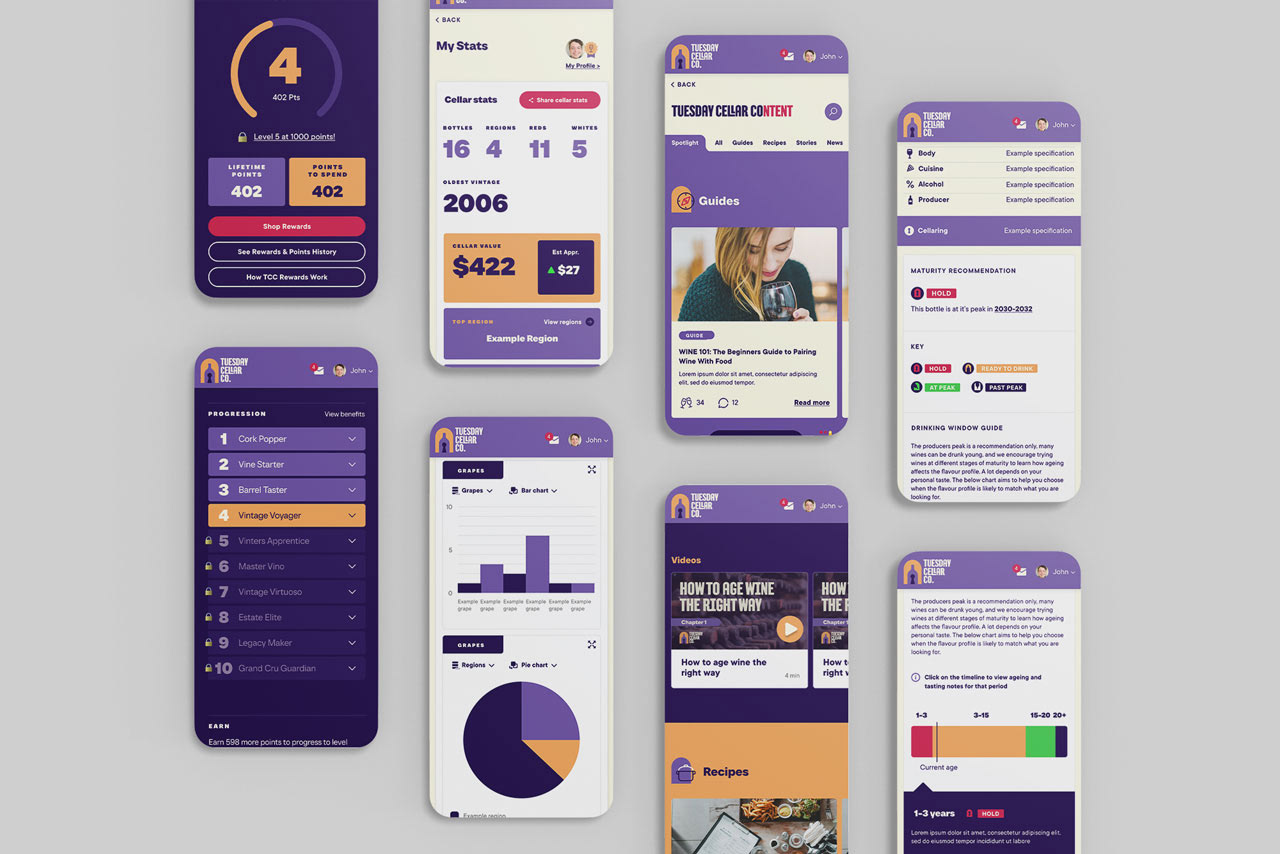
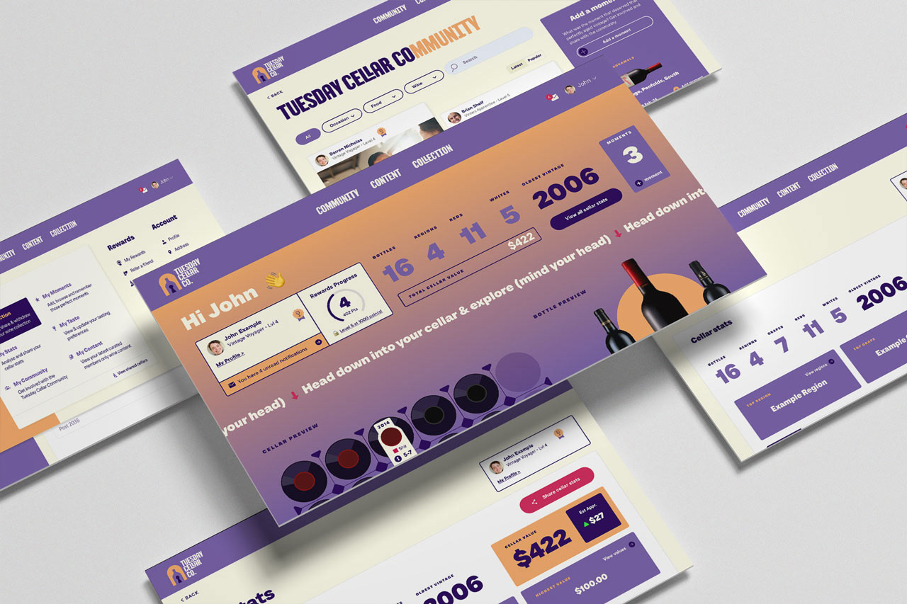
Website (see website section)
Virtual Cellar (see virtual cellar section)
Challenges
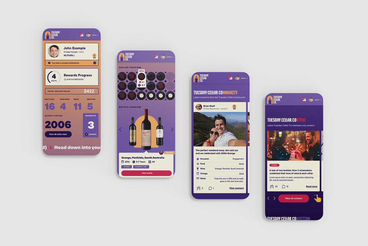
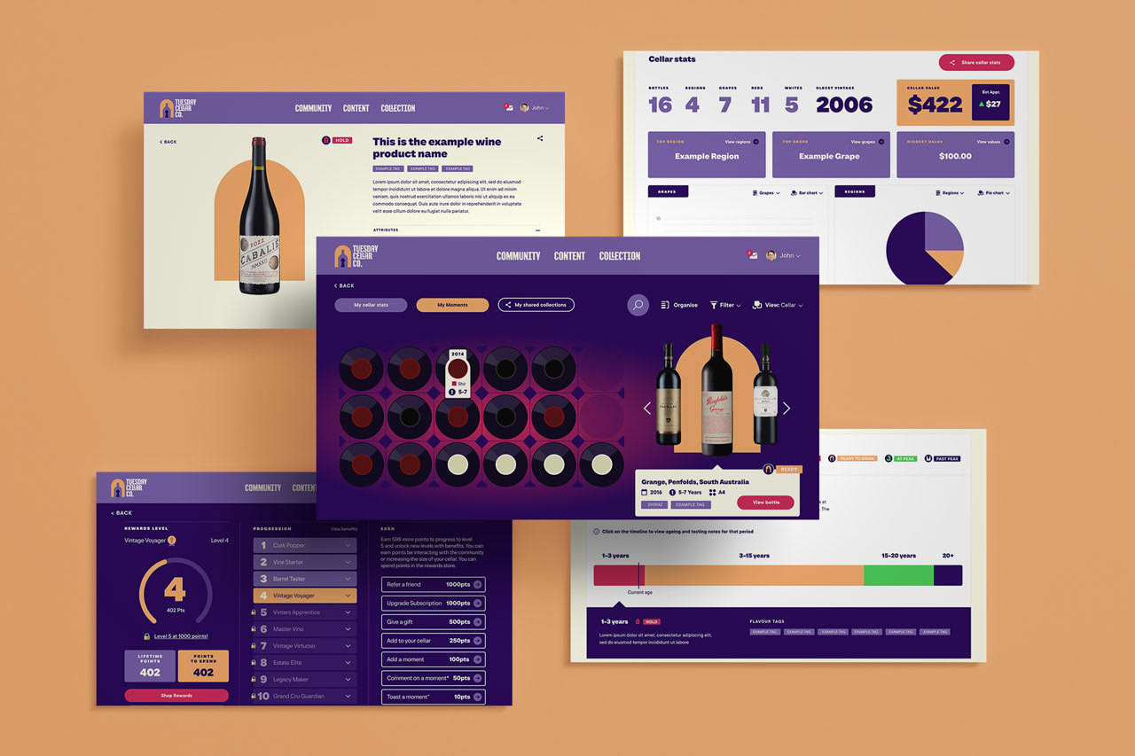
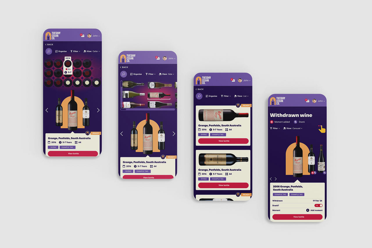
TANGIBILITY: The business is based around off-site cellaring managed via a digital platform, allowing anyone to own and manage a wine collection without the need for their own cellar space. Collecting is traditionally a physical experience and a key challenge was to translate and elevate this experience in the digital space.
BALANCE: Balancing creative and “fun” elements with a simple and clear UX for a novel product without an established UX
SOLUTION
It was important to design the branding and UX design in conjunction, as the digital product is so integral to the brand identity. This helped with creating a tangible, fun and engaging experience for something which is traditionally physical experience.
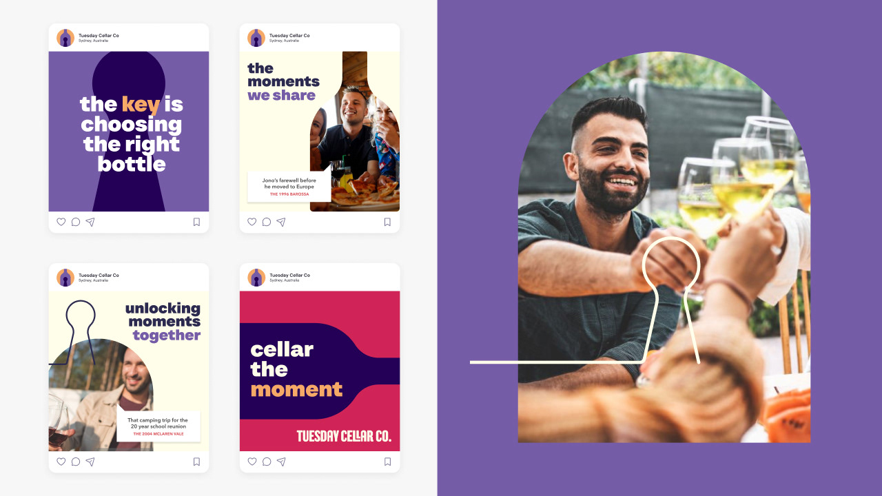
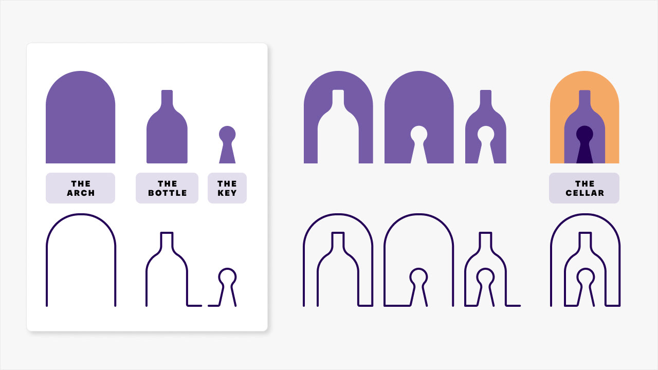
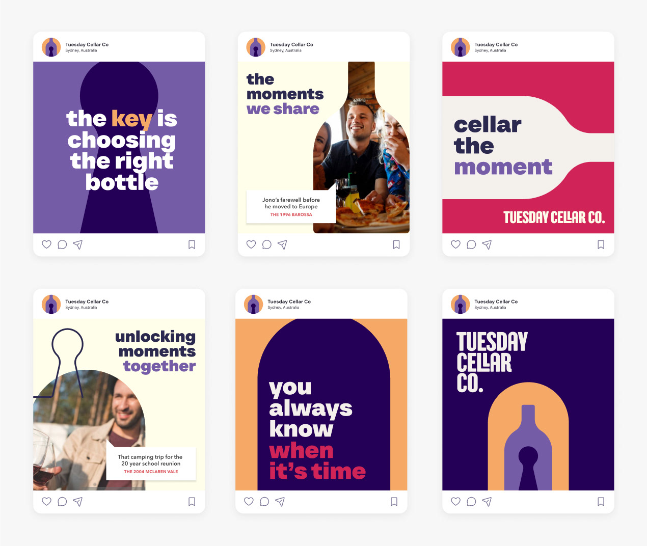
The 3 pillars of the product are COMMUNITY, COLLECTING & CONTENT, and we were able to build this into the branding via the “CO” element (See Branding section below). Using a day of the week incorporated a genuine origin story whilst also appealing to the everyday and positioning as an antithesis to wine-snobbery.
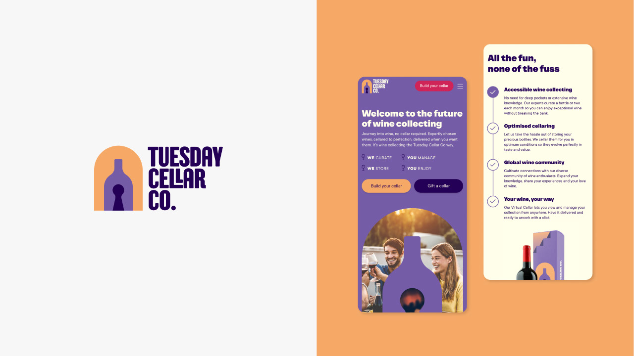
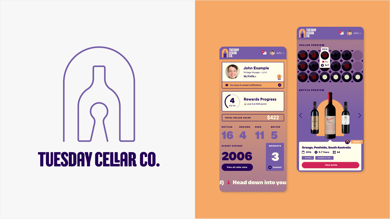
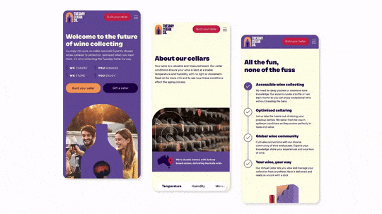
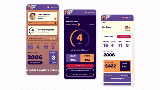
The solution was a bold and contemporary branding and UX, that played up to the benefits of the digital experience (connectivity, community, ease-of-use etc) whilst still creating an experience that is ultimately built around the collectable item, emphasising the physicality, with the ability to view and manage in detail individual bottles, and collections of bottles as a whole.
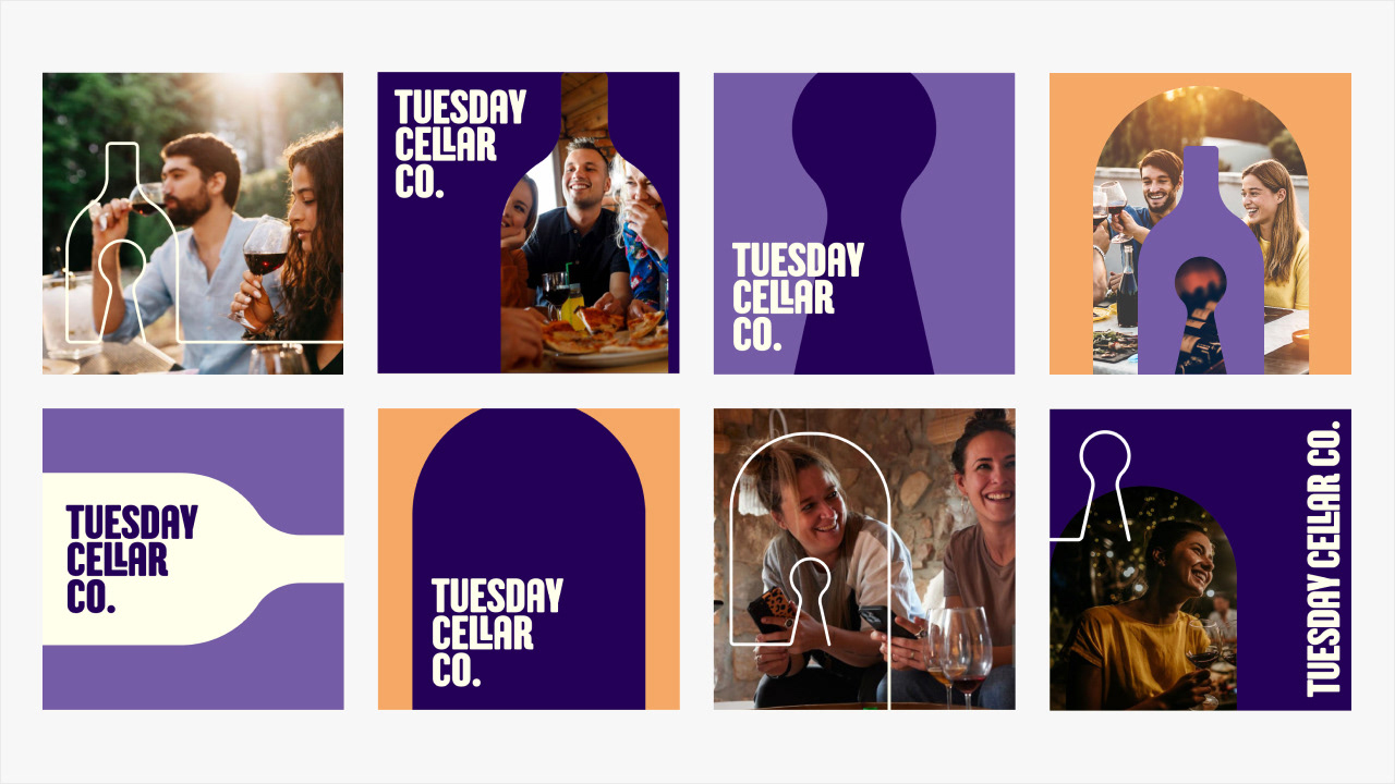
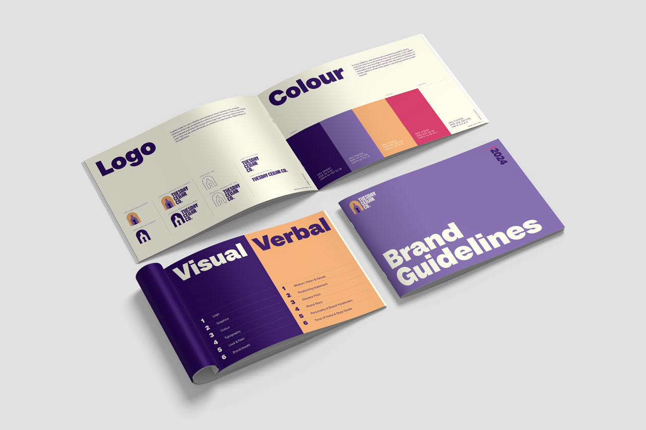
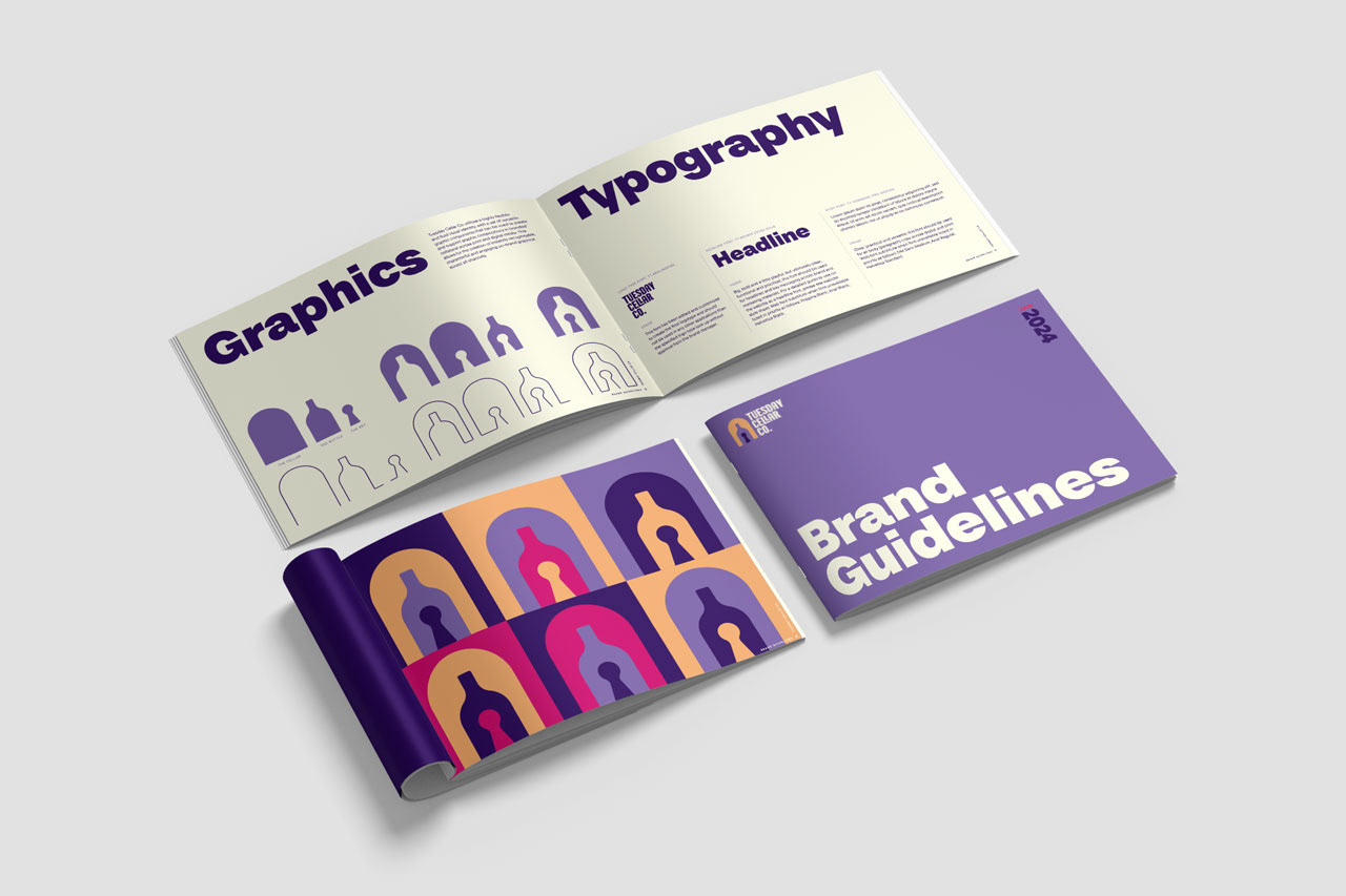
Branding
Tuesday Cellar Co uses a flexible and contextual visual identity, with multiple variations of the logo composed of a solid and monoline version of the Logo Mark, and a stacked and horizontal version of the Logo Type. The Logo Mark and the Logo Type can be used individually or combined as appropriate, depending on the application.
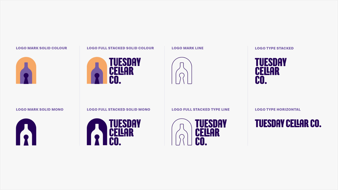
Tuesday Cellar Co uses a flexible and contextual visual identity, with multiple variations of the logo composed of a solid and monoline version of the Logo Mark, and a stacked and horizontal version of the Logo Type. The Logo Mark and the Logo Type can be used individually or combined as appropriate, depending on the application.


CAMPAIGN ASSETS
WEBSITE
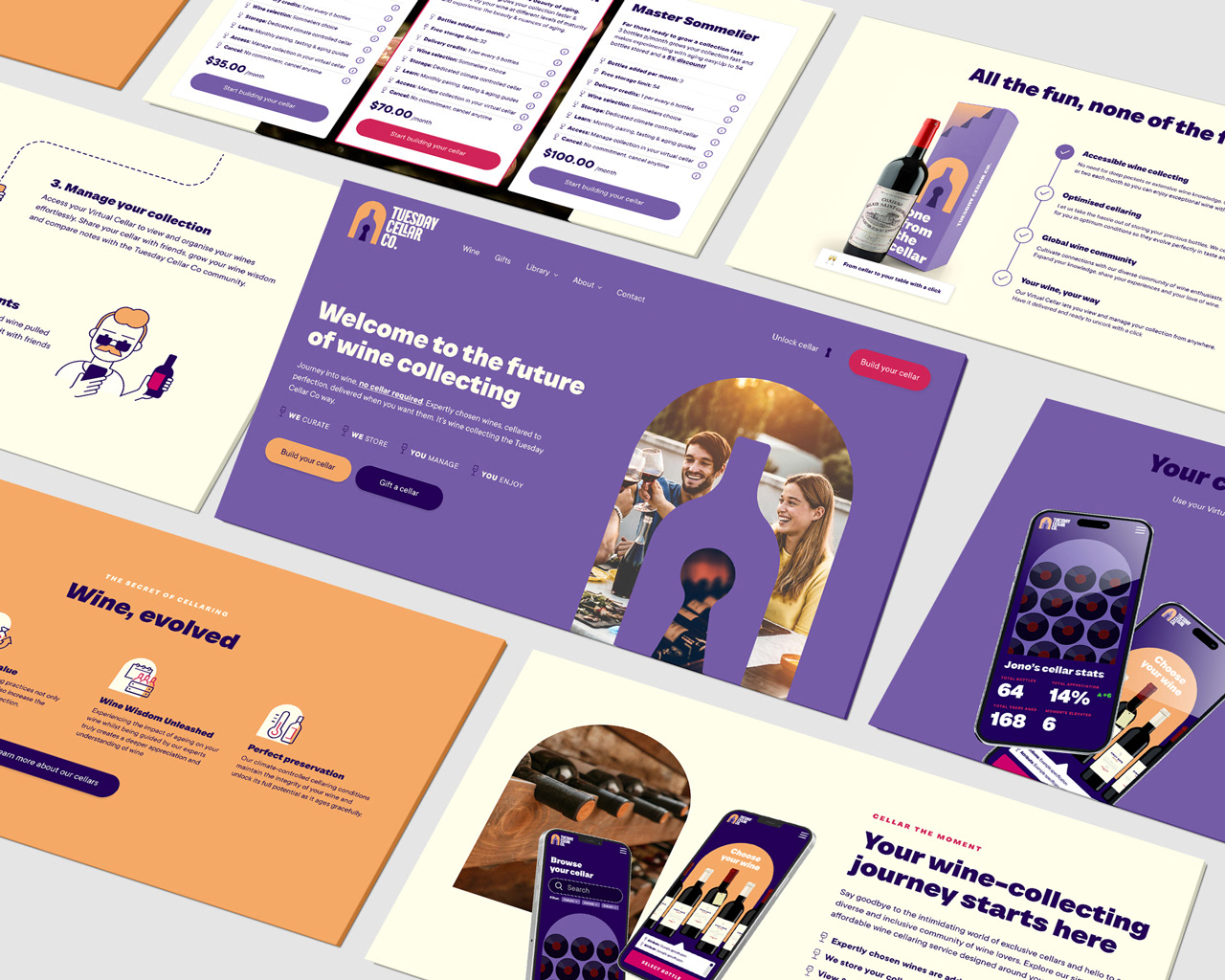
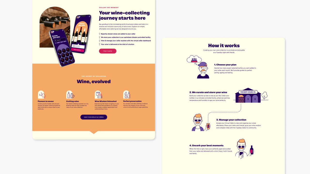
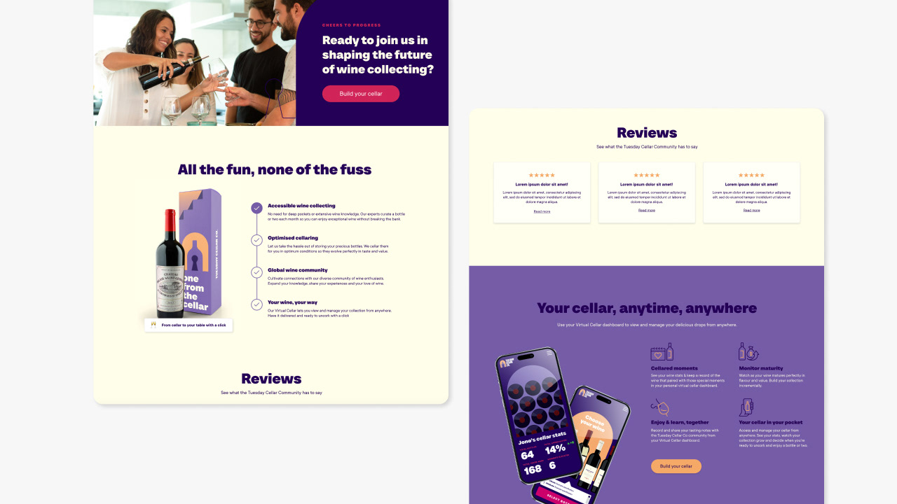


Virtual Cellar Dashboard