Design & production of a multi-audience website (and visual assets) with a range of core functions, built around a contextual taxonomy, including a creative facelift for the brands digital presence
CLIENT: Pariveda
INDUSTRY: Consultancy / Business / Technology
AGENCY: Orange Line
ROLE: Creative Director & Design Lead

OVERVIEW
Pariveda is a US consulting firm dedicated to solving complex technology and business problems. They were looking to create a high impact and engaging digital experience to showcase the company and it’s values to potential clients at the C suite level whilst also serving as a cornerstone resource for potential candidates, and for existing employees.
Brief in Brief
WANT: A complete website redesign and visual brand evolution as part of a wider brand evolution project.
BRAND VISUALS: Minimal, clean and scientific with playful accents.
AUDIENCE NOTES: Segmented: Modern business leaders (C suite), potential candidates, internal stakeholders, potential clients.
REQUIREMENT: Reflecting the brand ethos the the visual and digital. Bringing a creative and human corporate element to corporate branding.

Challenges
CONTEXTUAL TAXONOMY: Creating an expansive yet logical taxonomy for use by internal stakeholders that allows the right type of content to be seen by the appropriate audience on the site.
VISUAL LANGUAGE: Maintaining the integrity of an already respected brand and using this DNA to develop a new visual language using colour, custom icons, graphics, images & animations that stands out from the corporate crowd without losing the core tenets of expertise and authority, whilst embodying the brand values.
VISUAL LANGUAGE: Maintaining the integrity of an already respected brand and using this DNA to develop a new visual language using colour, custom icons, graphics, images & animations that stands out from the corporate crowd without losing the core tenets of expertise and authority, whilst embodying the brand values.
SOLUTION
Developing the solution for Pariveda involved a heavily collaborative approach in order to gain a deep understanding of the requirements of all the different internal stakeholders and to determine how content could be categorised for both internal and end users.
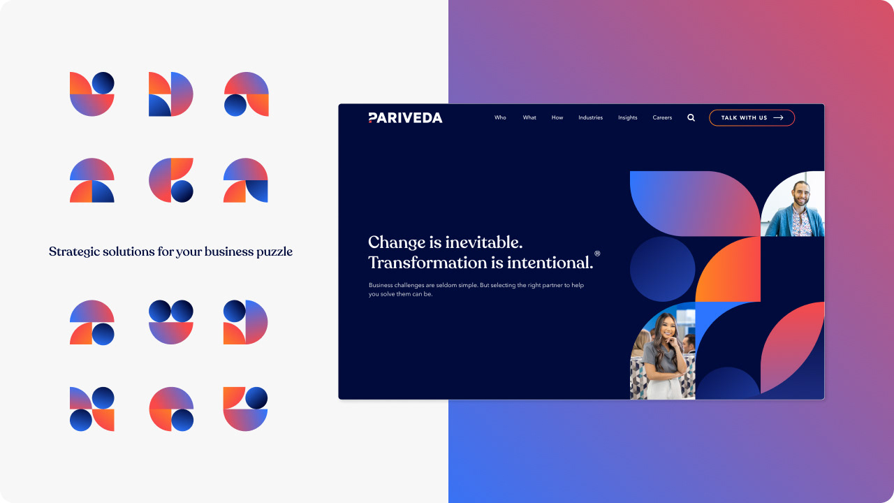
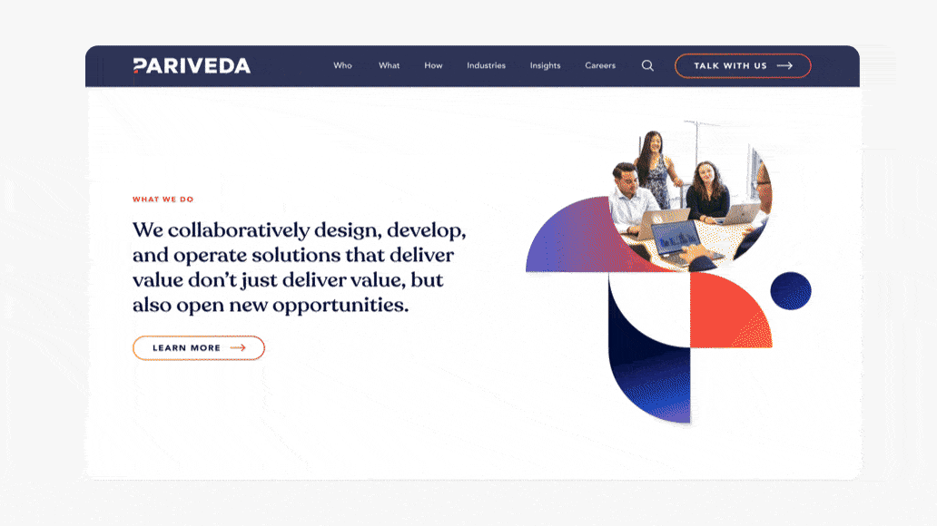
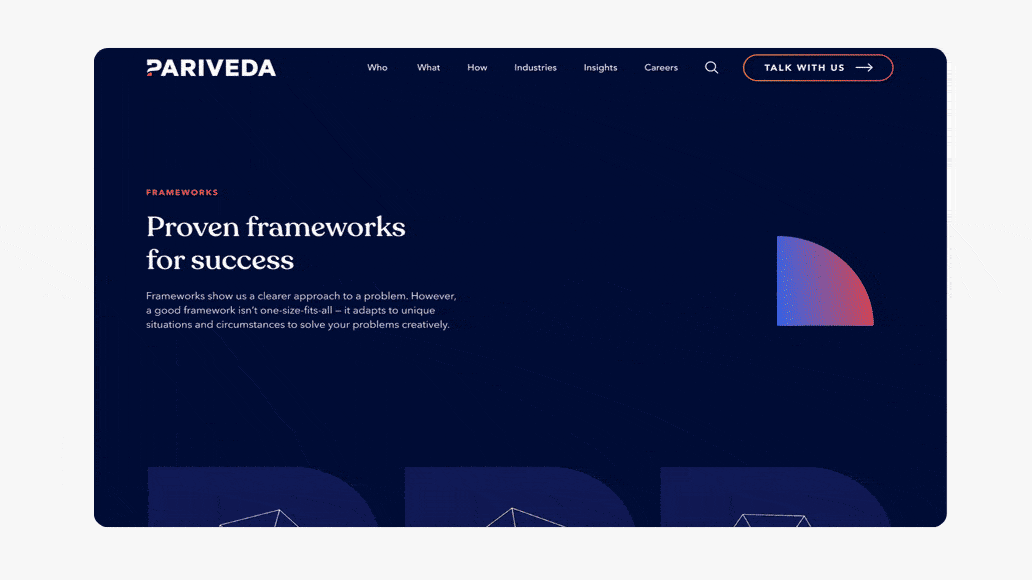
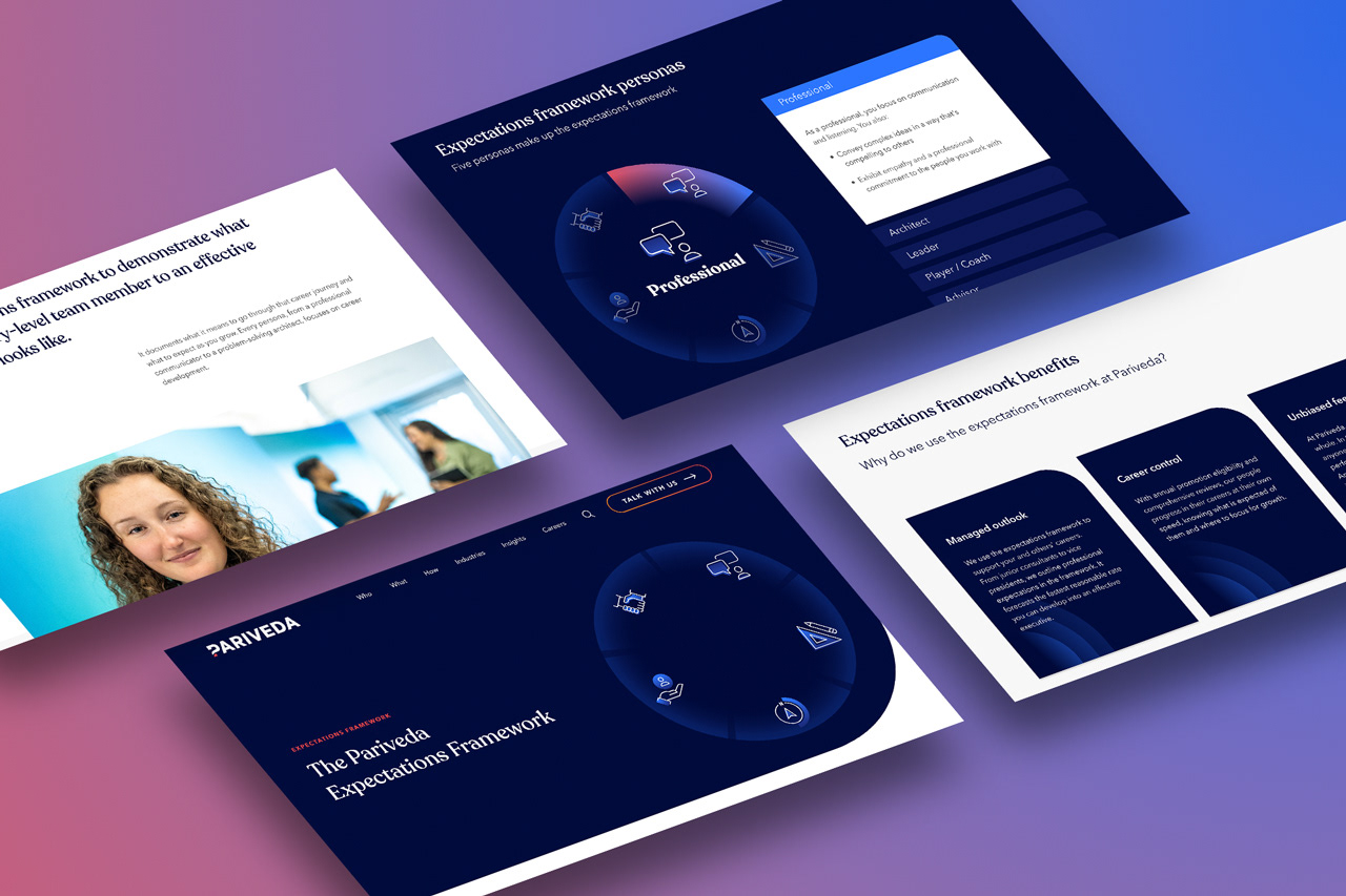
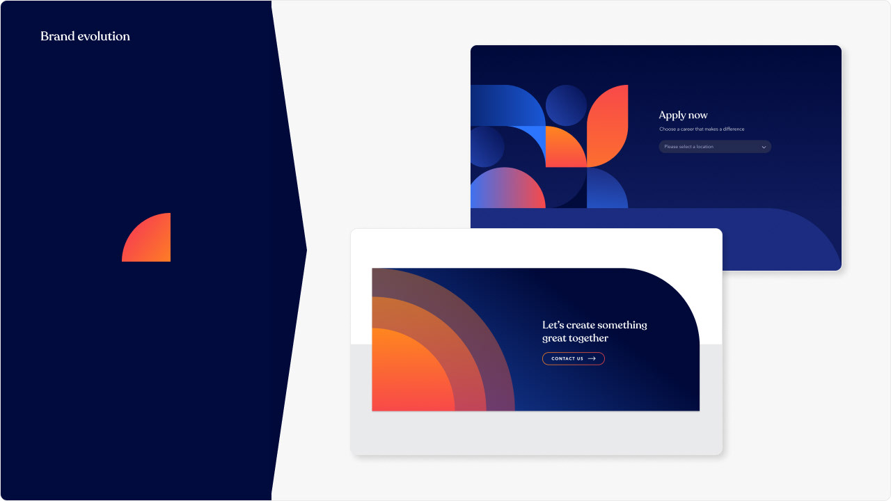
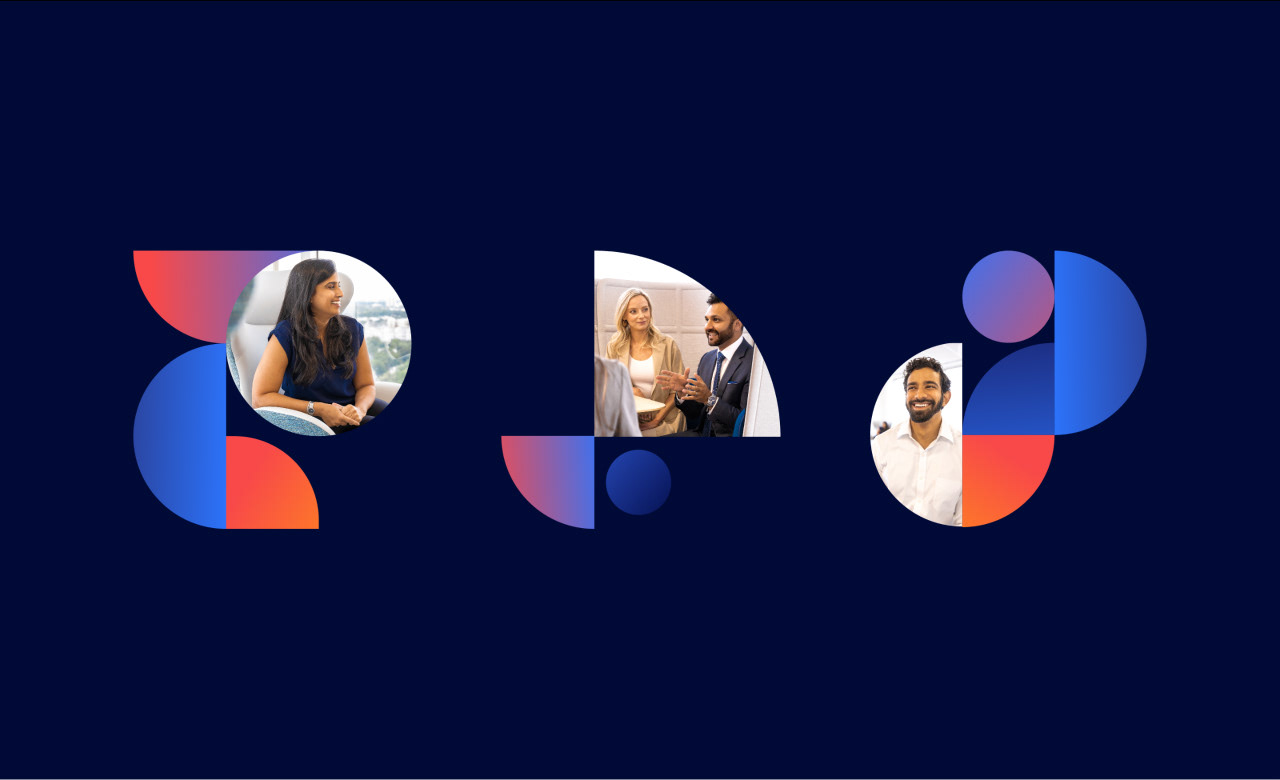
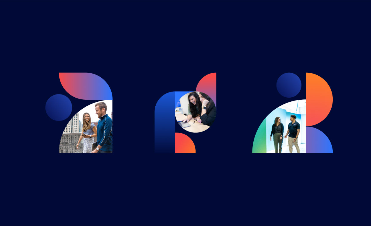
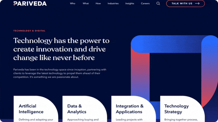
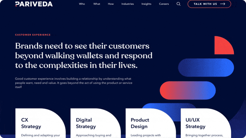
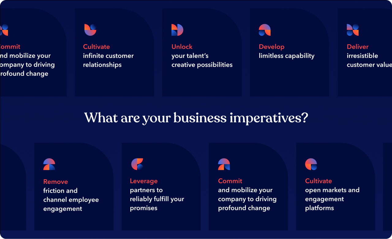
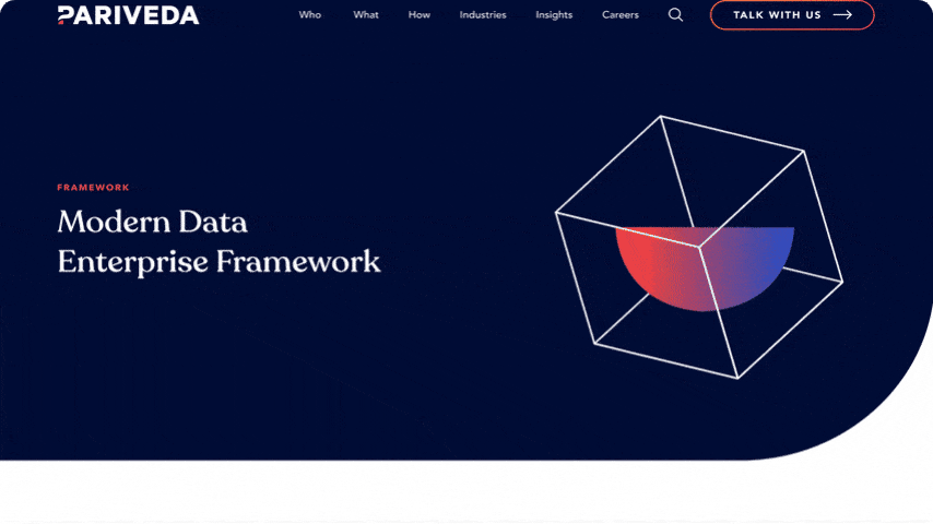
The visual language developed involved using the DNA of the original branding and expanding this into a large suite of graphic assets and interactive components that help to add tangibility to concepts and services that can be quite abstract. The brand pattern was used to create a versatile and dynamic visual language around "puzzle solving", "building", "collaboration" and "consolidation" that represents the bespoke, complex problem solving at the core of the business.
The visual language developed involved using the DNA of the original branding and expanding this into a large suite of graphic assets and interactive components that help to add tangibility to concepts and services that can be quite abstract. The brand pattern was used to create a versatile and dynamic visual language around "puzzle solving", "building", "collaboration" and "consolidation" that represents the bespoke, complex problem solving at the core of the business.
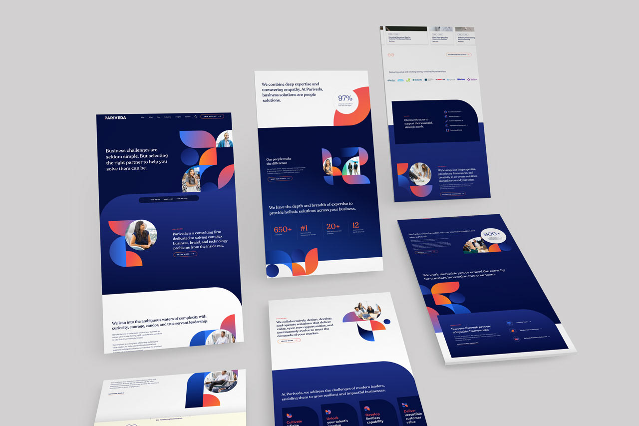
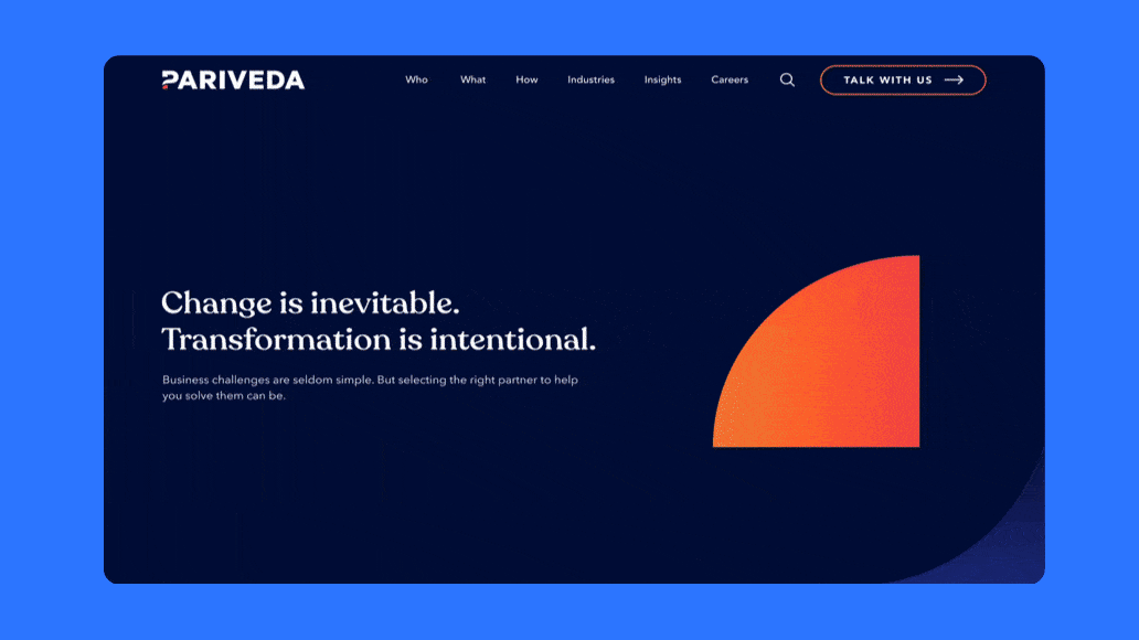
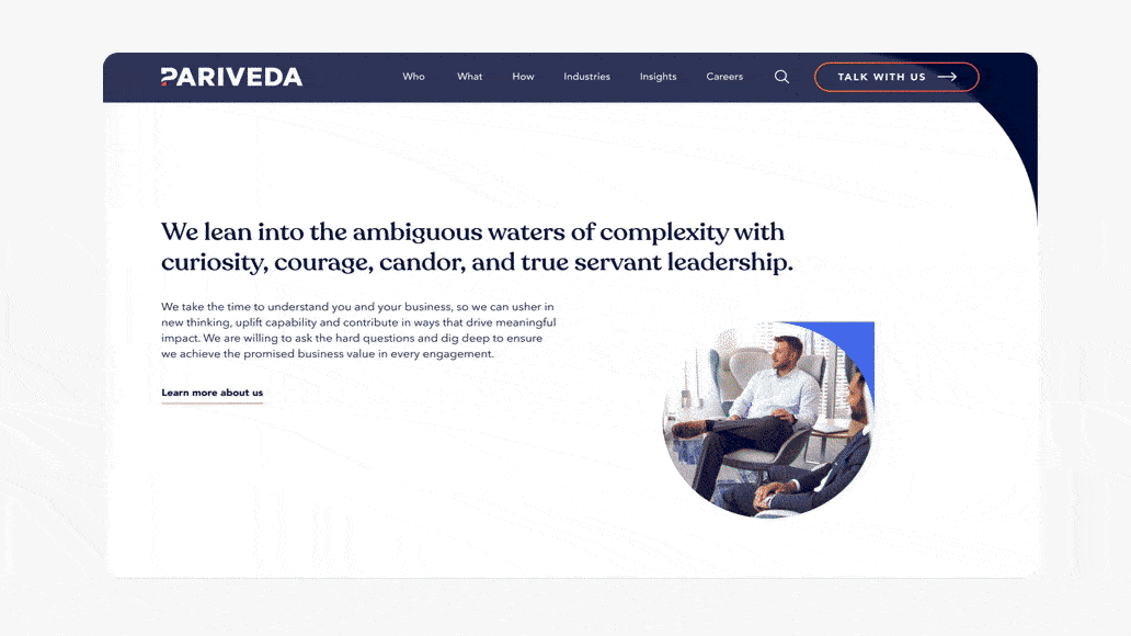
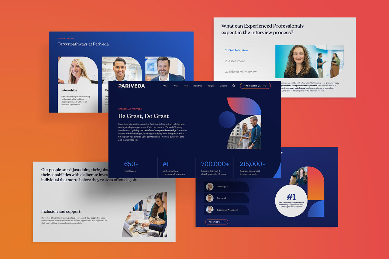
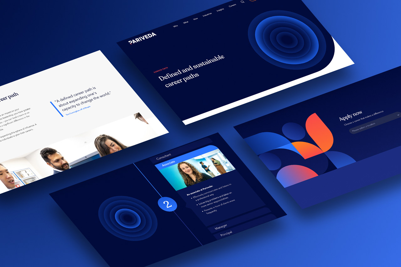
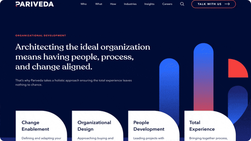
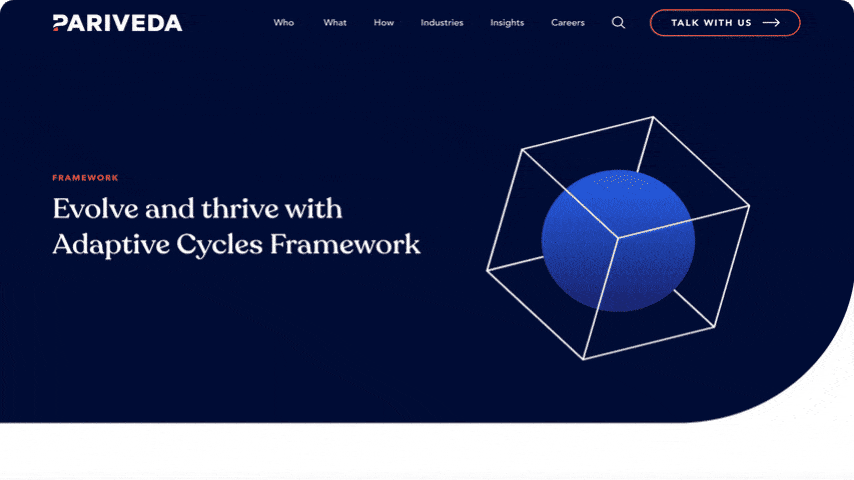
SELECTED desktop SCREENS
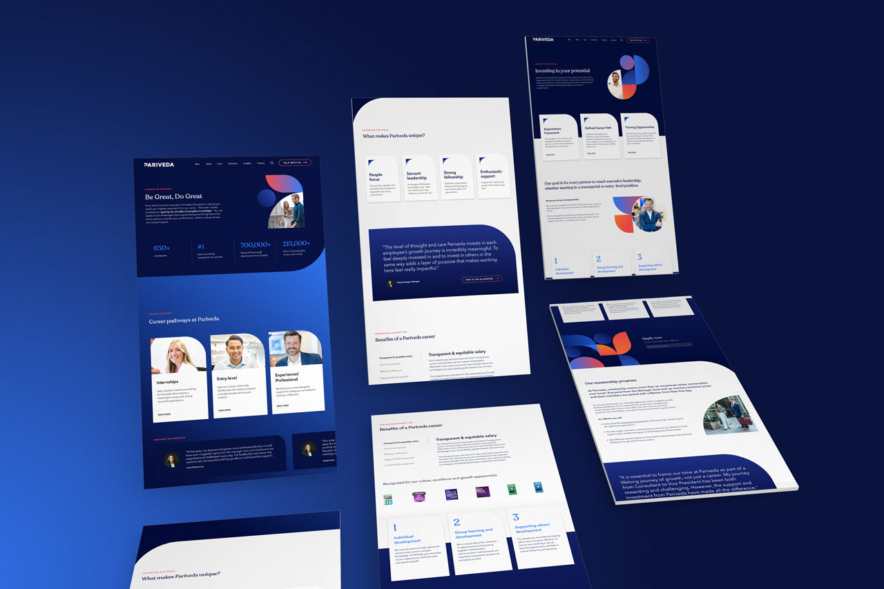
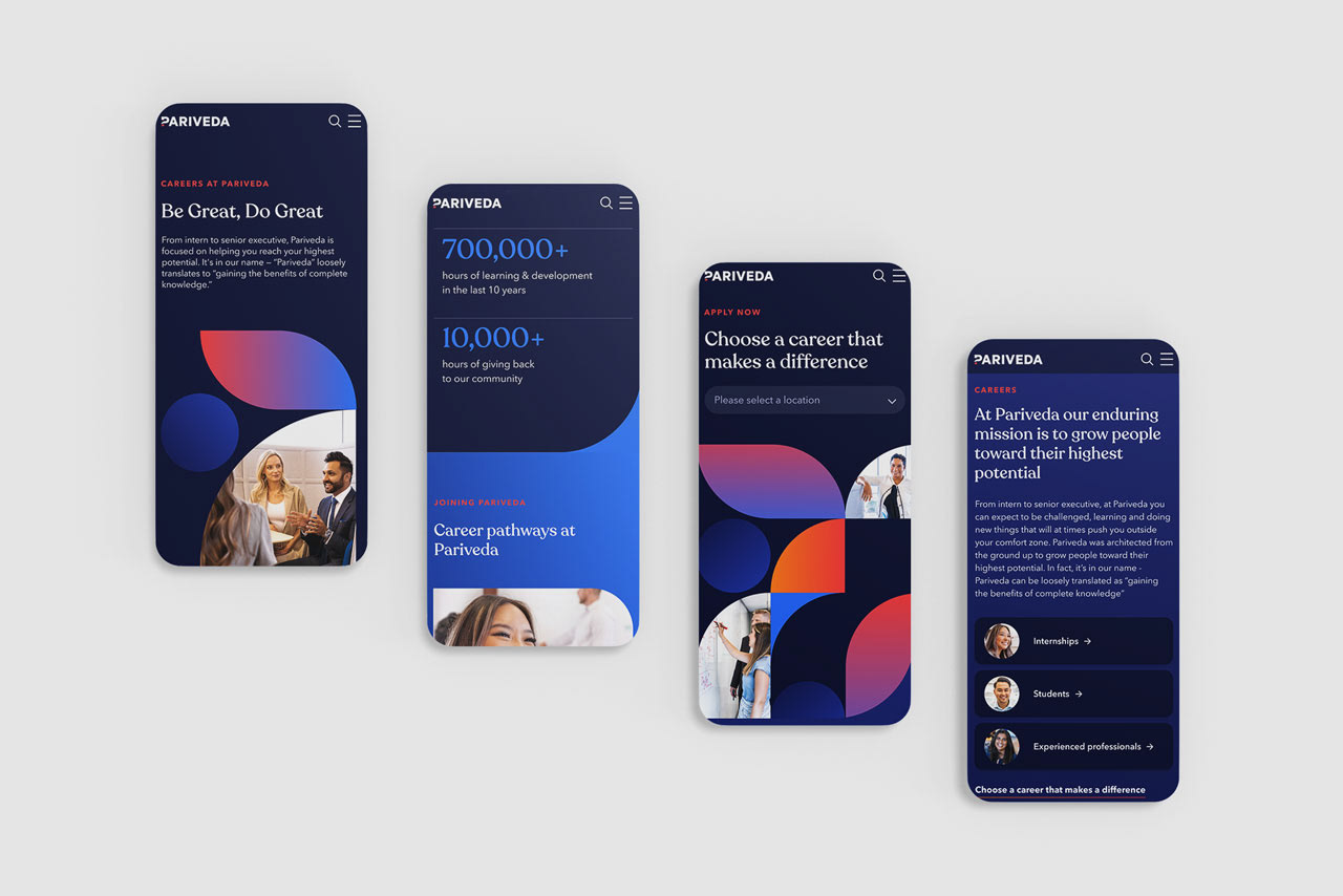
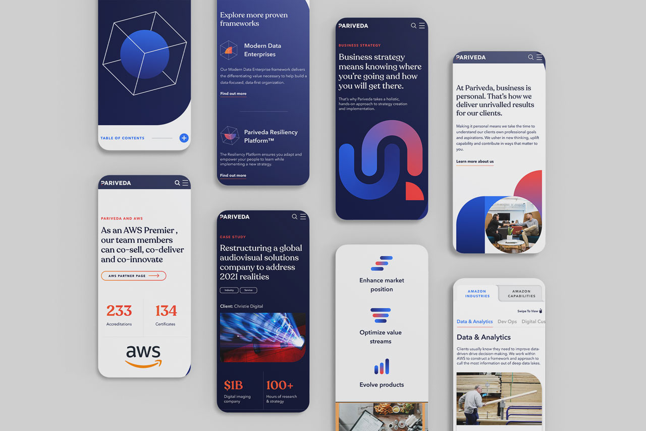
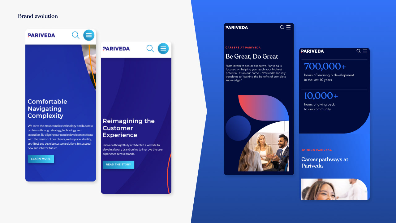
SELECTED mobile SCREENSHOTS
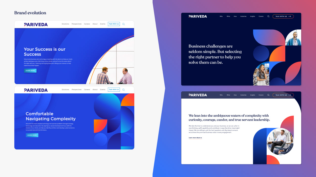
BRAND EVOLUTION
The business, the internet, and web design conventions had evolved significantly since the launch of the original website, and as such the website (and the implementation of the brand) was starting to no longer reflecting the current and future vision of the brand.
For this project, the recognisable visual DNA of the brand was kept intact (the logo and base colour palette) whilst everything else was given a refresh to bring the brand and website up to date: Fonts, expanded palette, use of gradients, new original imagery, graphics, icons and animation.
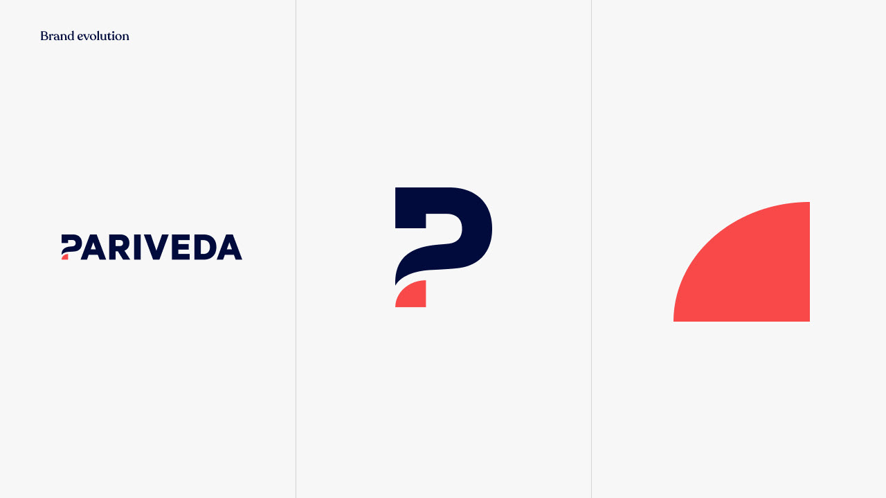
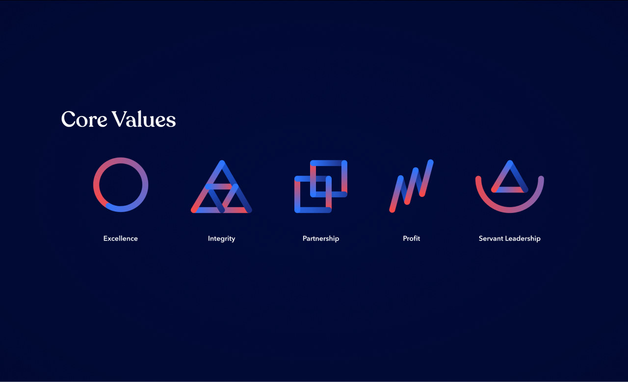
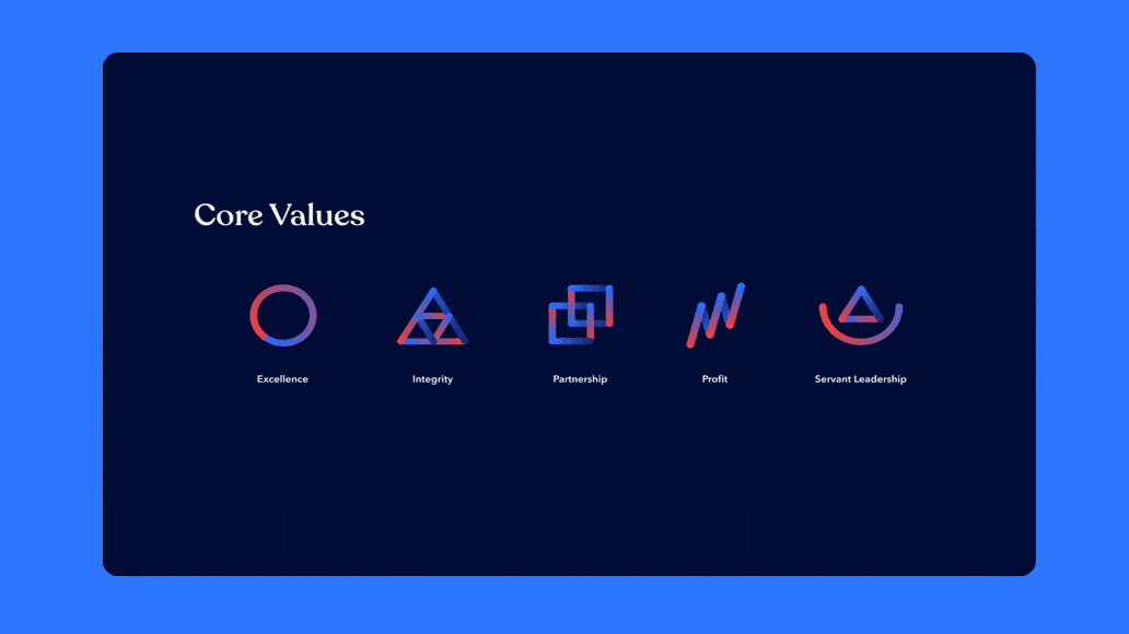
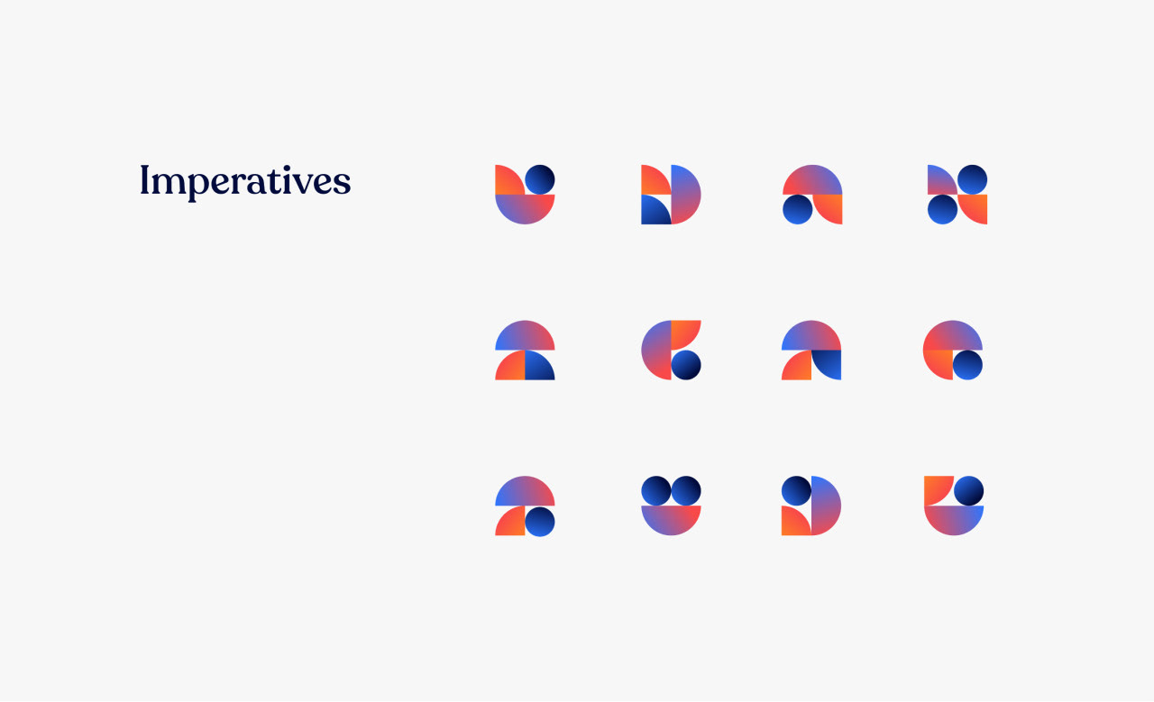
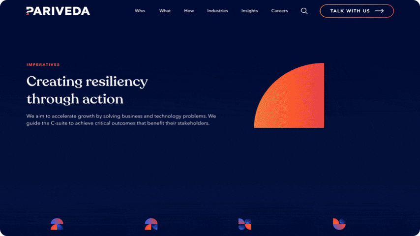
The "fin" graphic is a key component of the logo, and this terminology has even been woven into organisational usage relating to career pathways. We used expanded the use of the fin across the UX and visual assets, from image masks and icons, to section corners and call to actions, creating a unique, unified experience across the whole digital experience.
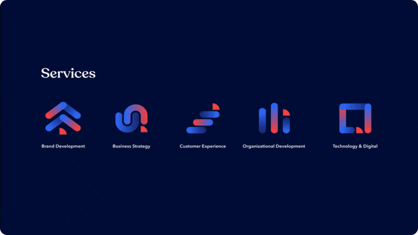
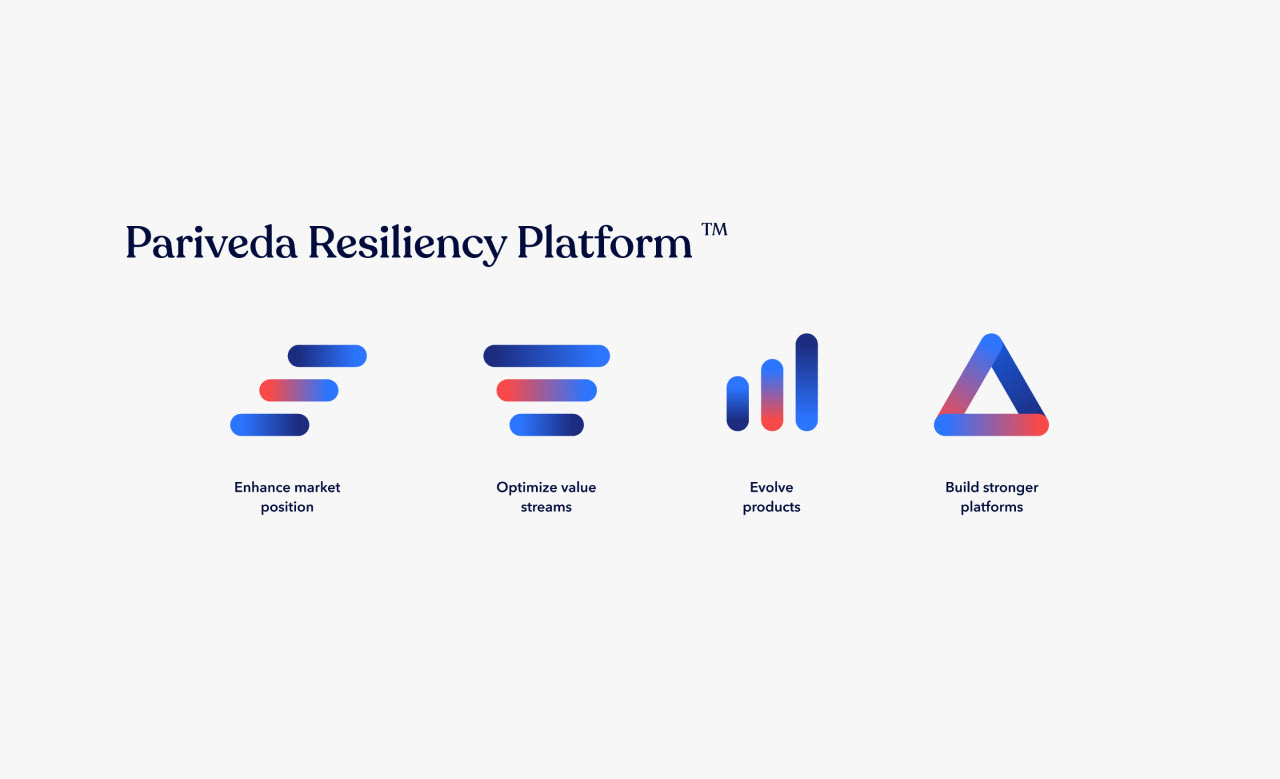
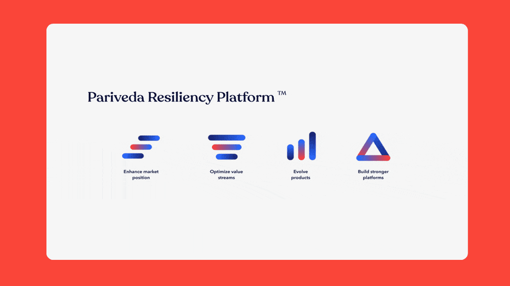
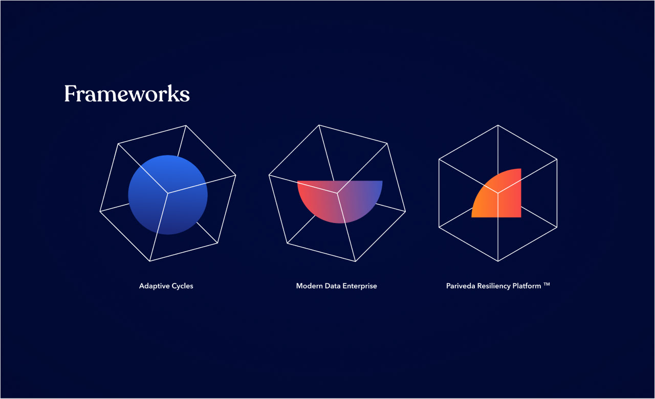
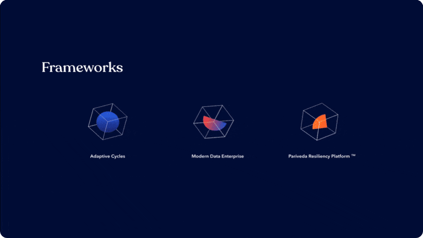
ICON SUITES
The "fin" graphic is a key component of the logo, and this terminology has even been woven into organisational usage relating to career pathways. We used expanded the use of the fin across the UX and visual assets, from image masks and icons, to section corners and call to actions, creating a unique, unified experience across the whole digital experience.


interactive modules
The "fin" graphic is a key component of the logo, and this terminology has even been woven into organisational usage relating to career pathways. We used expanded the use of the fin across the UX and visual assets, from image masks and icons, to section corners and call to actions, creating a unique, unified experience across the whole digital experience.