Website and custom brand illustrations & animations for a Sydney based digital agency, evolving the logo into a graphic language to help elevate abstract concepts, avoiding industry tropes.
CLIENT: Orangeline
INDUSTRY: Digital Marketing / Consulting
AGENCY: Orangeline
ROLE: Design Lead

OVERVIEW
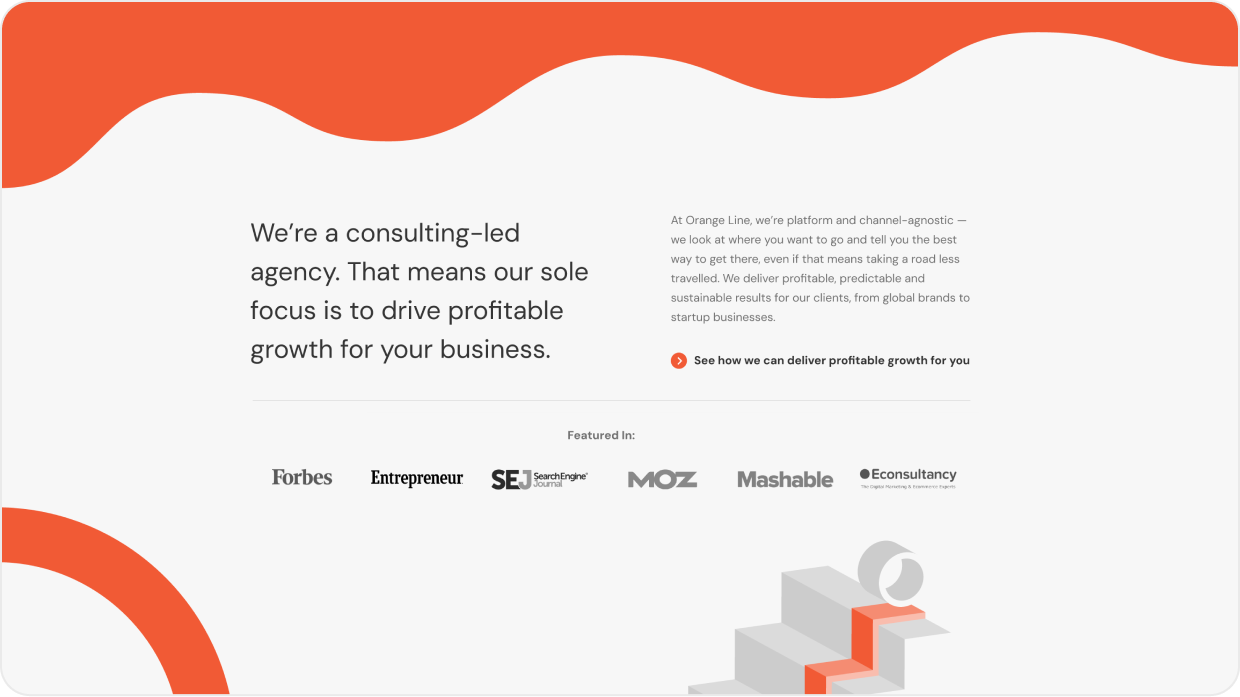
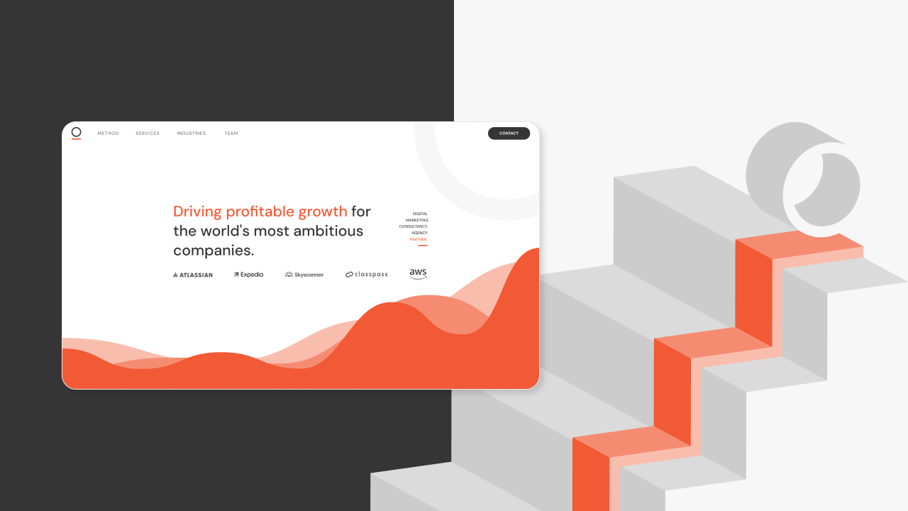
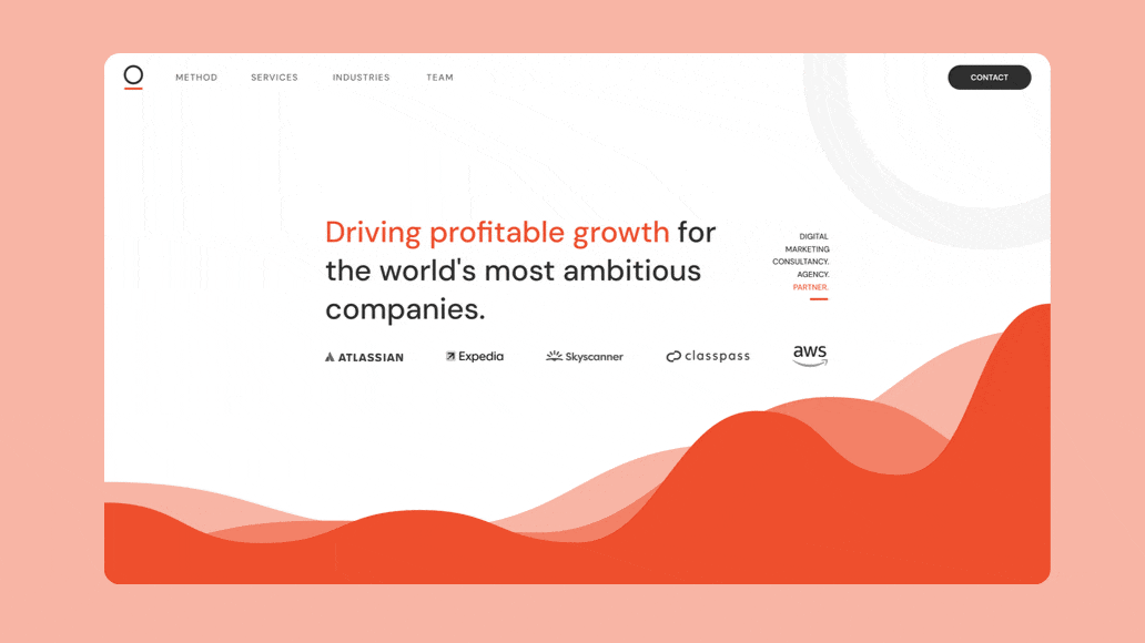
Orangeline needed a new website that better reflected their range of services and depth of expertise. The site needed to stand out in crowded space and help clearly communicate some complex concepts and processes along with the point of difference. The design needed to have growth and change built into it to accomodate the rapidly growing and mercurial nature of the business.
Brief in Brief
WANT: Clean and lean website that clearly showcases key strengths (data, processes and expertise) without being to dry or verbose
BRAND VISUALS: Clean and minimal but somehow adding a dash of playfulness and approachability to reflect the brand ethos.
AUDIENCE NOTES: Target audience of business leaders and marketing directors looking for a boutique data-driven digital agency that provides more than just off the shelf implementation.
REQUIREMENT: As a fast growing and mercurial business at the forefront marketing tech, it was important not to take the conventional cookie cutter agency approach and also build in scope for growth, change and evolution.
Challenges
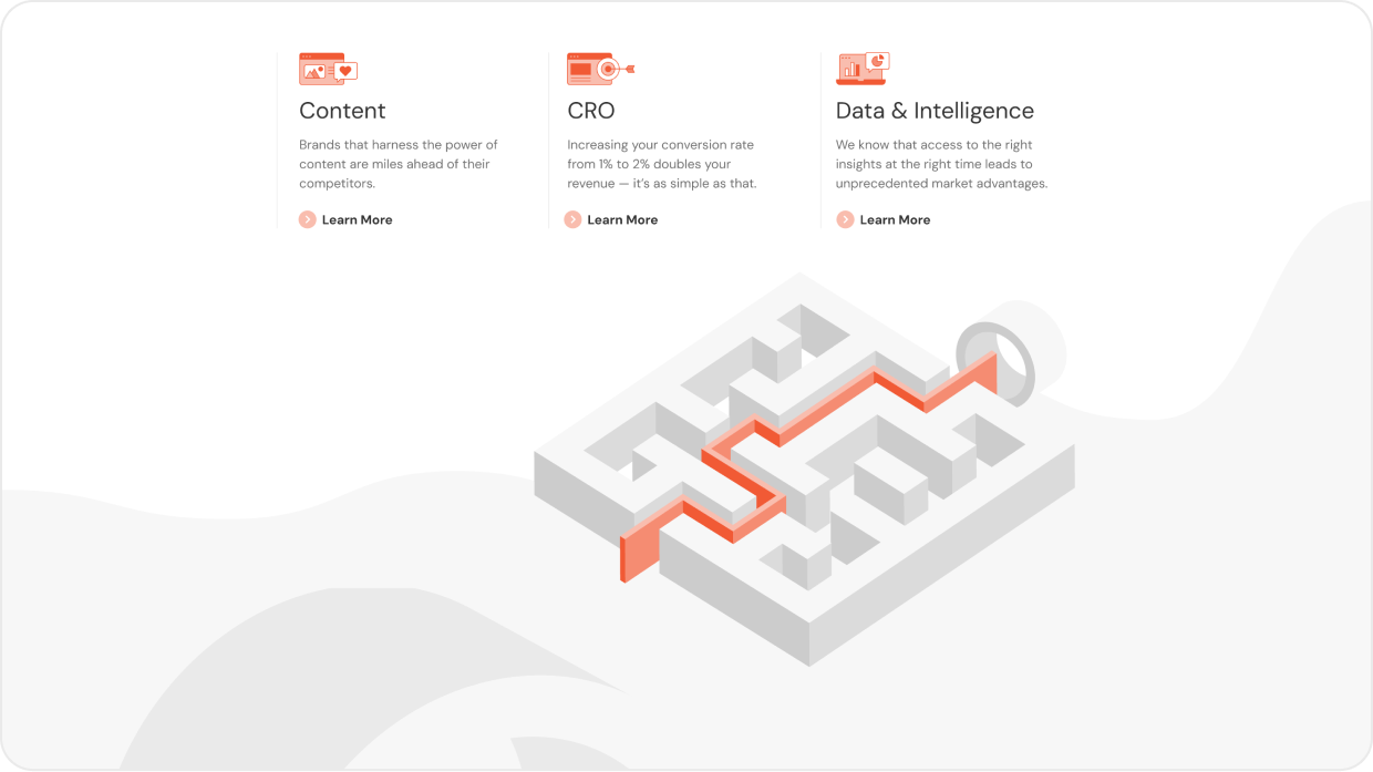
BALANCE & COMPLEXITY: A key aspect of the project was to clearly communicate complex expertise and processes without too much industry jargon, and presenting this in a way that was still digestible and not too dry.
BUILDING FOR CHANGE: As a fast growing and mercurial business in the realm of consultancy & marketing tech, it was important that the digital visual language of the brand be robust and malleable to accomodate changing landscapes and priorities.
BUILDING FOR CHANGE: As a fast growing and mercurial business in the realm of consultancy & marketing tech, it was important that the digital visual language of the brand be robust and malleable to accomodate changing landscapes and priorities.

SOLUTION
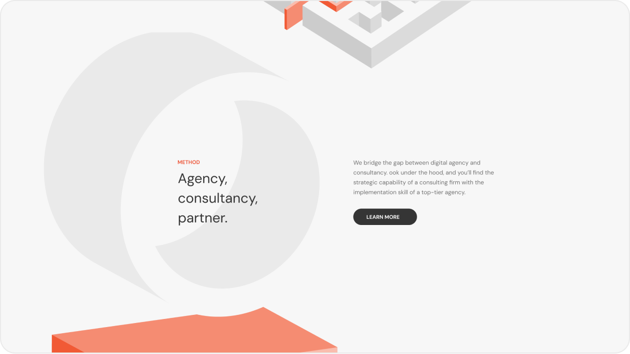
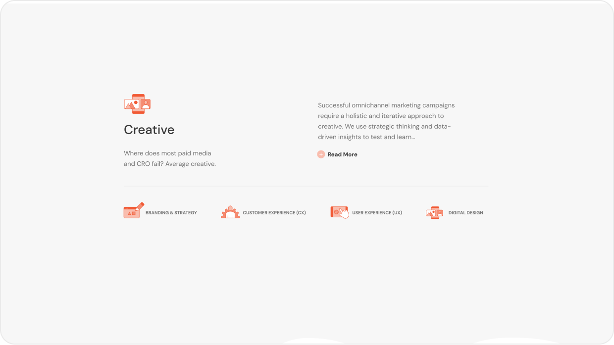
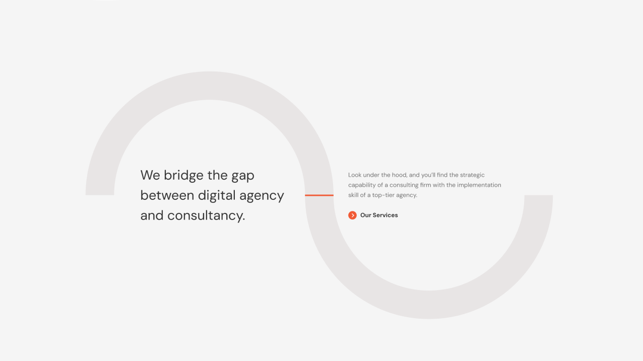
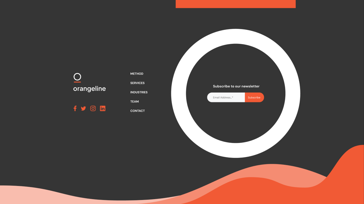
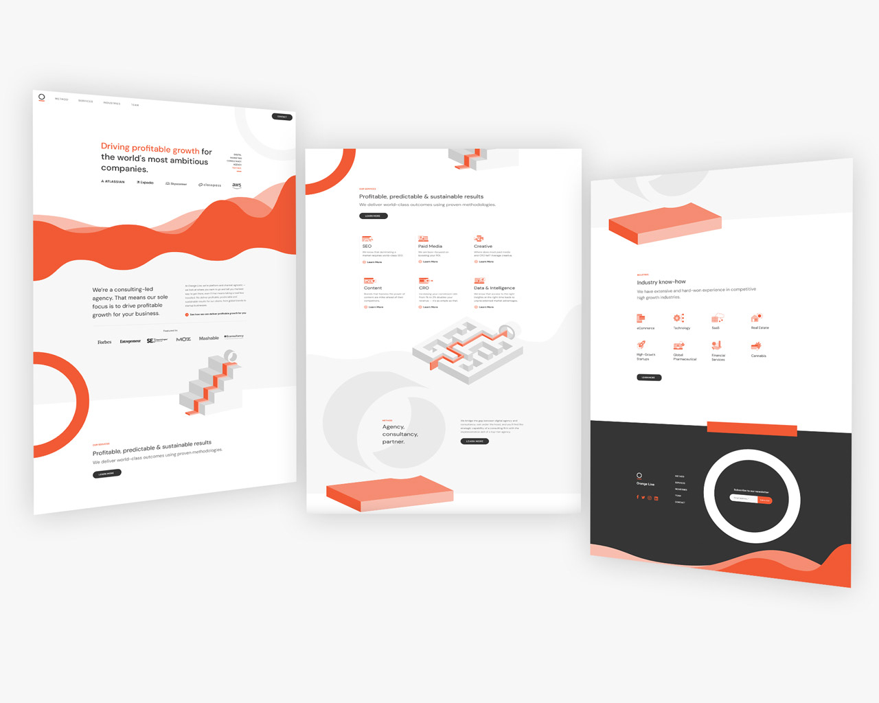
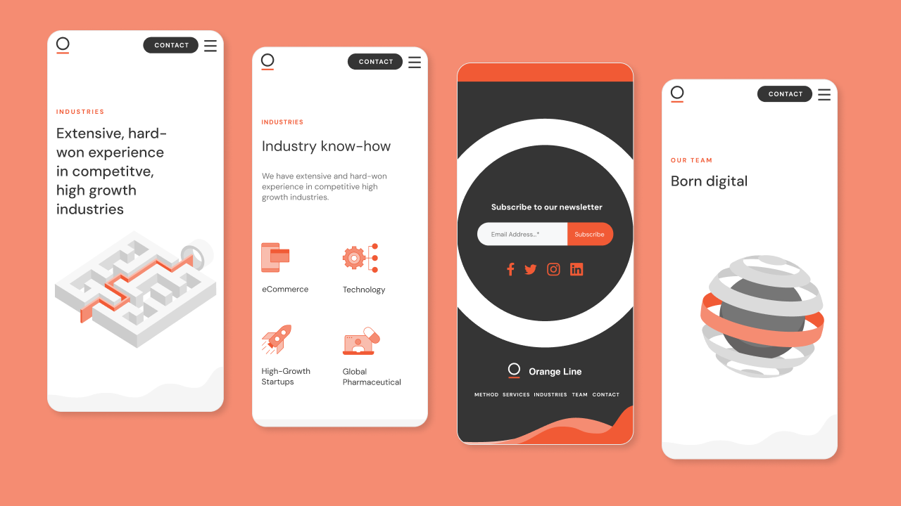
The solution involved using the orange line logo symbol to develop a versatile graphic style and suite of assets that expanded the mysterious "orange line" into a graphic device.
A number of simple brand animated illustrations were designed to help with the communication of abstract concepts and to create a more engaging user experience (In certain parts of the site the animation playback was tied to the mouse scroll).
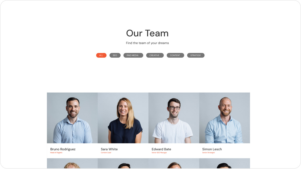
A large suite of custom icons were also created and all this was packaged in contemporary crisp, minimal, lean UX that clearly communicated the ethos of the brand.
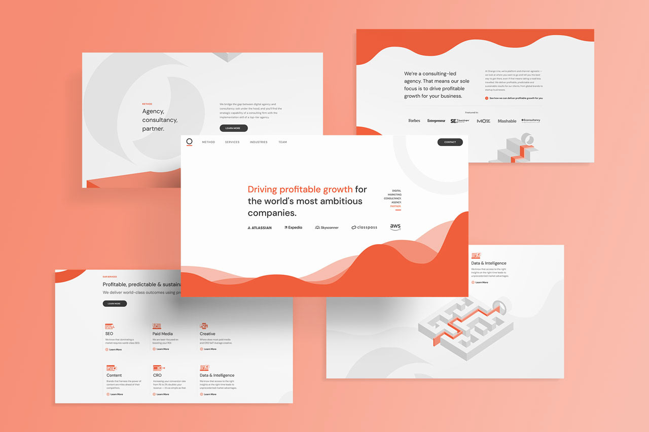
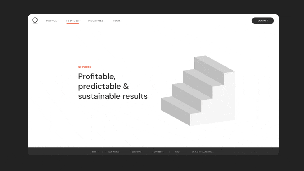
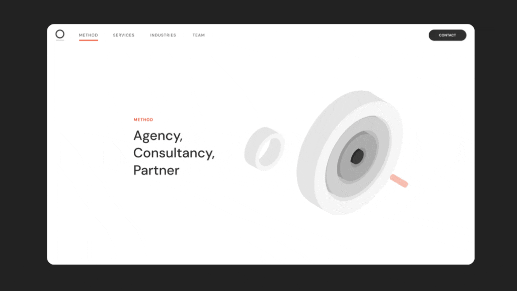
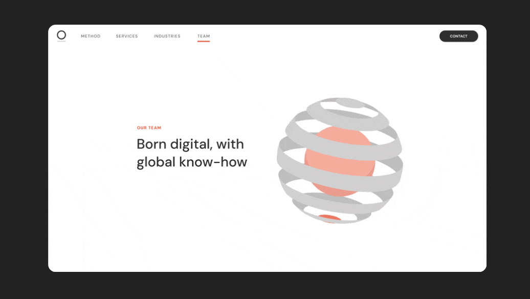
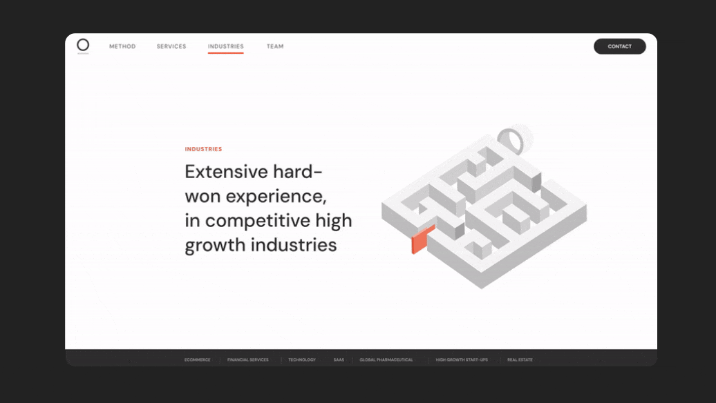
SELECTED desktop SCREENSHOTS